How to Build a Room Material Palette
- Choose the room together, not purchase by purchase
- Start with a fixed-material inventory
- Pick one dominant material
- Give every supporting material a role
- Work from expensive and fixed to small and flexible
- Build a physical material board
- Test the palette in the room's real light
- Balance texture before adding another colour
- Check the material, not just the appearance
- Put health and installation limits before style
- Run a practical wear test
- Use a one-page decision sheet
- Edit the palette before buying accents
Choose the room together, not purchase by purchase
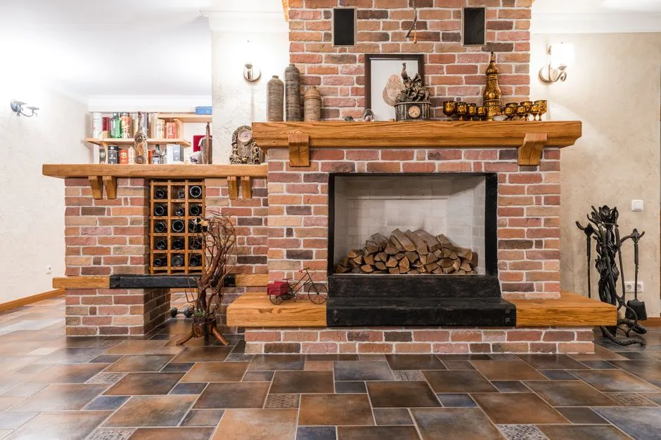
To choose materials for a room, begin with what must stay: floor, fireplace, built-ins, counters, large furniture, and the room's actual light. Pick one dominant material, then give each supporting material a job in colour, texture, sheen, or contrast. Test real samples together in the room before buying. Decide costly, fixed surfaces first; fabrics, lamps, hardware, and small accents can follow.
This method prevents a familiar problem: every item looked perfectly pleasant on its own product page, yet the room now feels like six separate conversations happening over one another. The answer is not stricter matching. It is clearer relationships.
Start with a fixed-material inventory
Do not begin with an empty mood board unless the room is genuinely empty and unfinished. Most rooms already contain decisions you cannot or do not want to reverse.
List every visible material that will stay:
- floor material, colour, grain, joint pattern, and sheen;
- fireplace brick, tile, stone, or surround;
- window and door frames;
- built-ins, cabinetry, or exposed beams;
- radiators, vents, and permanent metalwork;
- large upholstery or case goods you are keeping;
- adjoining floors or finishes visible through doorways.
Take one photograph facing each wall in daylight and another with the evening lamps on. Then write descriptions rather than brand colour names: pale golden oak, blue-grey slate, creamy matte paint, dark brown leather, brushed silver metal. A poetic paint name can be charming, but it is not a colour measurement.
Mark each item fixed, costly to change, or easy to change. A stone hearth belongs in the first group. A sofa may be in the second. A cushion cover is firmly in the third, however emotionally persuasive it was in the shop.
Pick one dominant material
The dominant material is the surface with the greatest visual authority. It may be the floor, a wall of cabinetry, a large stone fireplace, or a substantial upholstered piece. It does not have to be the material you love most. It is the one the room must answer.
Describe four things about it:
- Temperature: does it read warm, cool, or fairly neutral?
- Value: is it light, middle, or dark?
- Movement: is the grain, veining, weave, or pattern quiet or active?
- Sheen: is the surface matte, satin, brushed, polished, or glossy?
These are relationships, not laboratory categories. A grey stone can lean warm beside a blue wall and cool beside honey-toned wood. A walnut table may look calm on a plain rug and very active against a strongly veined floor. Always describe the material beside its neighbours.
If the dominant surface is wood, our guide to mixing wood tones in one room shows how undertone, grain, value, and repetition matter more than matching species names.
Give every supporting material a role
A coherent room does not need one material repeated everywhere. It needs a reason for each material to be present.
| Material role | What it can contribute | What to check beside the anchor |
|---|---|---|
| Supporting wood | A lighter, darker, or contrasting grain | Undertone, visible area, grain scale, finish type |
| Metal | A precise dark line, warm glint, or cool quiet note | Colour and sheen separately; polished brass behaves differently from brushed brass |
| Stone or ceramic | Weight, irregularity, pattern, or a cool visual pause | Vein direction, grout, edge, and how much pattern is visible |
| Paint or plaster | The field that changes every other colour | Undertone on each wall, trim relationship, day and evening light |
| Upholstery | A large soft plane and repeated everyday contact | Wear, cleaning instructions, nap, seam, and full-width colour |
| Rug and curtains | Scale, softness, sound absorption, and a bridge among colours | Pattern repeat, pile or weave, sun exposure, and relationship to floor |
| Small accents | Repetition and controlled contrast | Whether they connect existing materials or merely add another one |
Aim for a dominant material, one or two clear supporters, and a small number of accents. That is an editorial method, not a mathematical ratio. You do not need to calculate 60 percent wood, 30 percent fabric, and 10 percent metal. Visible area changes with viewpoint, and a narrow black frame can carry more visual weight than its area suggests.
Work from expensive and fixed to small and flexible
The most useful order of decisions is:
- fixed floor, fireplace, cabinetry, and architectural finishes;
- large furniture and any new built-in surface;
- wall and trim paint;
- rug and full-length window textiles;
- principal lighting and repeated metal finish;
- cushions, art frames, trays, and other small accents.
This is not a law that says paint must always follow the sofa. It is a way to protect the budget. Thousands of upholstery choices can answer one floor; replacing the floor to rescue one chair is a more demanding plot.
When two major purchases are both undecided, choose them together. Put the floor sample beneath the sofa fabric, the wood sample beside the rug, and the metal finish near the stone. A sequence still needs a shared table.
Build a physical material board
A screen can organize ideas, but it cannot show true scale, texture, reflectivity, or the way the room's light changes a surface. Assemble the largest physical samples you can borrow or buy:
- paint on movable card, painted to the maker's coverage directions;
- upholstery and curtain fabric with the nap or weave marked;
- actual wood finish, not only an image of the species;
- flooring or tile showing both surface and edge;
- metal finish samples from the relevant manufacturer;
- rug swatch, when available.
Put the samples in their intended orientation. Floor material lies flat. Curtain fabric hangs. A cabinet door stands upright. Light meets those planes differently.
Group the samples in roughly the proportions visible from the room's usual entrance and seating positions. A tiny square of lively stone may look charming beside a full fabric swatch even though the installed stone will occupy an entire wall. Scale the board honestly, or lay larger samples in the room.
Write the product code, material composition, finish, supplier, date, and return status on the back of every sample. Two nearly identical whites become surprisingly confident strangers once their labels fall off.
Test the palette in the room's real light
Move the sample group to every wall or zone where the materials will appear. Look in morning daylight, the brightest part of the day, late afternoon, and under the lamps normally used at night. Do not judge a wall colour under a temporary work light if the finished room will use warm table lamps.
Watch for three changes:
- a neutral suddenly reading pink, green, violet, yellow, or blue;
- a polished surface throwing a bright reflection from a window or lamp;
- two near-matching materials separating into obviously different undertones.
Near-matches are often harder than clear contrasts. A pale oak beside a slightly pink beige may look accidental, while the same oak beside a definite deep blue can look deliberate. If two materials almost agree, either move them closer through a better sample or farther apart through clear contrast.
Keep the samples in place for an ordinary day when practical. A room is not viewed only from the most flattering corner at noon.
Balance texture before adding another colour
When a palette feels flat, the missing element may be texture rather than colour. A room of smooth painted walls, smooth laminate, smooth leather, and polished metal can feel hard even when every hue coordinates. Add a visible weave, open grain, matte ceramic, woolly pile, basket fibre, or softly rumpled linen before introducing another accent colour.
The reverse also applies. Heavily figured wood, dramatic stone, patterned upholstery, and a thick rug can all compete at once. Let one large surface carry the strongest movement and allow adjacent materials to quiet down.
Contrast sheen intentionally. A small polished metal can lift a mostly matte room. Several large glossy surfaces may multiply reflections and visual noise. The finish name matters as much as the metal name: brushed nickel and polished nickel are related, but they do different work.
Check the material, not just the appearance
Before purchasing, read the current specification. Similar-looking products can be solid wood, veneer, laminate, printed film, engineered stone, natural stone, wool, viscose, polyester, leather, or coated fabric. Construction changes care, repair, wear, weight, installation, and price.
For every significant surface, record:
- actual material and surface coating;
- cleaning method and prohibited cleaners;
- water, heat, stain, and light-exposure limits;
- installation and ventilation instructions;
- warranty exclusions;
- replacement availability or dye-lot variation;
- sample-to-production variation disclosed by the maker.
Do not infer durability from words such as natural, artisan, premium, or commercial. Those terms do not tell you whether a table tolerates a hot mug or whether a pale sofa cover can be washed.
Environmental claims deserve the same precision. The Federal Trade Commission's Green Guides summary says marketers should avoid broad, unqualified claims such as “green” or “eco-friendly” and should state specific benefits. Ask what percentage is recycled, which component the claim covers, which certification applies, and what the care or disposal condition is.
Put health and installation limits before style
Paints, coatings, adhesives, building materials, and furnishings can release volatile organic compounds. EPA's current indoor-air guidance on VOCs directs users to follow label precautions, increase ventilation for products that emit VOCs, and use household products according to manufacturer instructions.
For composite wood, “wood” alone is not a complete specification. EPA explains that hardwood plywood, medium-density fibreboard, and particleboard are made by binding wood components with adhesives and are covered by federal formaldehyde-emission rules. Its consumer FAQ says regulated products and finished goods manufactured or imported into the United States after March 22, 2019 must be labelled TSCA Title VI compliant.
Follow product labels, building requirements, and installer instructions. Ventilate as directed. Keep children and pets out of work areas. Lead, asbestos, mould, electrical changes, structural alteration, stone cutting, and removal of unknown old coatings require appropriate testing and qualified professional handling. Do not turn a visual sample exercise into an unplanned demolition.
Run a practical wear test
The palette must survive the room's job. Write down what contacts each surface in an ordinary week: shoes, wet coats, pet claws, food, make-up, sunlight, hot cookware, rolling desk chairs, children's art supplies, or frequent cleaning.
Ask material-specific questions:
- Can the upholstery cover be removed, and what does its label permit?
- Does a stone or wood surface require periodic sealing, and who will do it?
- Will a rug pile interfere with a door or rolling chair?
- Does the floor finish tolerate the cleaner already used in the home?
- Can a damaged tile, board, or fabric panel be replaced individually?
- Will direct sun change the appearance, according to the maker?
A beautiful material that requires care nobody will perform is not the practical choice for that room. This is not a moral failure. It is useful information gathered before the invoice.
Use a one-page decision sheet
Before approving a major purchase, fill in this short record:
| Decision | Your answer |
|---|---|
| Dominant material | Material, temperature, value, movement, sheen |
| Fixed supporters | Floor, stone, built-ins, large retained furniture |
| New material's job | Relate, bridge, quiet, or contrast |
| Real-room test | Walls, times of day, lamps used |
| Composition | Actual substrate, surface, coating, and fibre |
| Care and wear | Cleaning, heat, water, sunlight, traffic |
| Safety and installation | Label, ventilation, qualified work, local requirements |
| Exit route | Sample approval, return terms, spare material, repair path |
Save this sheet with sample codes and photographs. If the room grows slowly, it becomes a reference for the next purchase. You do not have to remember which almost-white paint turned green beside the floor six months ago.
Edit the palette before buying accents
Place the major materials together, remove unrelated small décor, and view the room from the entrance and normal seats. Ask four questions:
- Is one material isolated with no relationship to anything else?
- Are two near-matches fighting?
- Is every large surface patterned, glossy, or visually loud?
- Does the palette suit the room's cleaning, traffic, and maintenance reality?
Fix the smallest cause first. Move a piece, introduce a textile bridge, change one finish, or repeat one existing note. Browse the material palette collection before adding another permanent surface.
A room feels cohesive when its materials acknowledge one another and still leave space for use, change, and the odd object brought home for sentimental reasons. Agreement is enough. The floor and lamp do not need matching surnames.
This article provides general interior-planning information. Follow product labels, manufacturer instructions, building requirements, and qualified professional guidance for hazardous materials, installation, structural work, and electrical work.