How to Mix Wood Tones in One Room
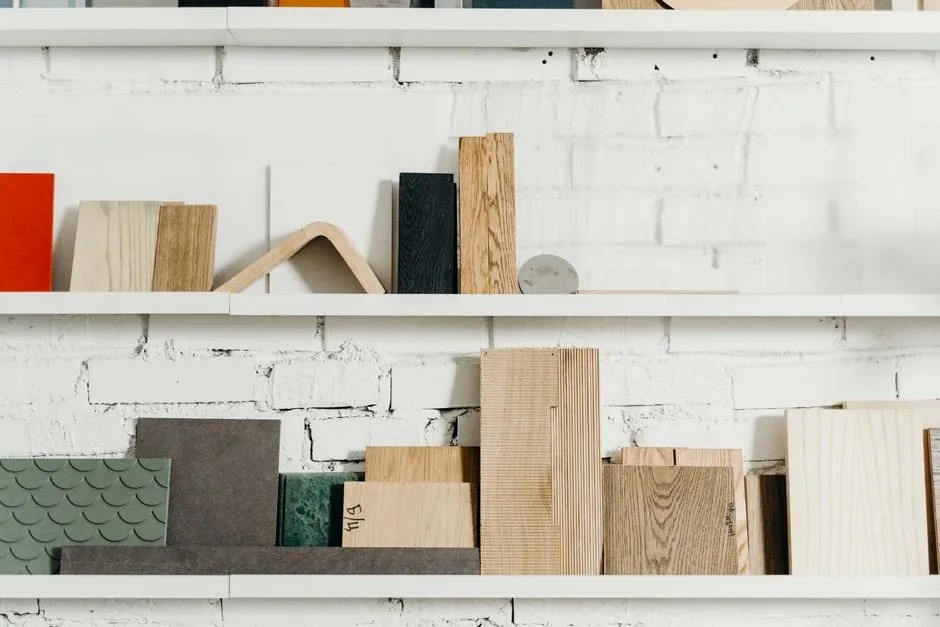
Choose a dominant wood, not a matching set
A room can mix oak, walnut, pine, ash, teak, stained veneer, and painted wood without looking accidental. Begin by identifying the dominant wood tone: usually the largest fixed or visual surface, such as flooring, cabinetry, a dining table, or a substantial built-in.
Dominant does not mean every other piece must imitate it. It gives the eye a home base. Photograph that surface in daylight and under the lamps used at night. Camera color is imperfect, so keep a physical sample or view candidates in the room whenever possible.
Do not identify a product by appearance alone. Solid wood, veneer, laminate, printed finish, and composite construction can look similar in a photograph but differ in repair, wear, care, and price. Read the current material specification.
Describe warmth before species
Ask whether the dominant finish reads warm, cool, neutral, red, golden, gray, or nearly black in the actual room. Wood species can vary naturally, and stains can move the same species across undertones. “Oak matches oak” is not a reliable palette rule when one sample is pale pink and the other appears smoked gray.
Place samples beside the floor or main piece, not several meters away. Look for a relationship:
- related: similar warmth at a lighter or darker value;
- contrasting: clearly different but intentional;
- clashing: close enough to seem mistaken, with undertones pulling against each other.
Test a possible clash with the room's paint, rug, and lighting before issuing a restraining order.
Browse material palette for undertone and finish sampling.
Use a simple 60–30–10 rhythm cautiously
Instead of applying a rigid formula, think in rough visual roles: dominant wood, supporting wood, and a smaller accent. The numbers often quoted in decorating are prompts, not measurements you need to calculate from square centimeters.
For example, an oak floor may dominate; walnut table and shelves may support; pale cane or a dark-stained frame may appear as accents. Repeat the support or accent at least once across the room so it looks placed, not stranded. A walnut table can connect to a frame, tray, lamp base, or chair detail without every object becoming walnut.
Do not buy accessories solely to repeat a tone. Existing book covers, basket fibers, picture frames, and furniture legs may already do the work.
Separate similar tones with texture
Two medium-brown pieces can blur together when both are glossy, flat, and visually heavy. Vary grain scale, sheen, edge shape, and material texture. A matte open-grain cabinet can sit near a smoother table when their undertones relate and their silhouettes differ.
Textiles create breathing room. A rug between wood flooring and a wood table interrupts the almost-match. Upholstered chairs, linen curtains, stone, metal, ceramic, and painted surfaces keep the palette from resembling a timber sample library after closing time.
Use the painter's-tape layout test to confirm that visual separation also works at full scale.
Let one bridge color connect the woods
A bridge material can carry several tones at once: a rug with tan, rust, cream, and charcoal; artwork with golden and deep brown; a woven shade containing pale and dark fibers. The bridge does not need to match every piece exactly. It simply makes the range feel intentional.
Wall color affects the reading. Warm white may emphasize gold; a cooler gray may pull ashier notes forward. Sample paint and wood together on each relevant wall because directional daylight and artificial light change them throughout the day.
Light bulbs also alter color appearance. Compare samples under the fixtures and settings used in the room, not only beneath a store's bright ceiling.
Watch scale and distribution
Balance is not just color. Three dark wood pieces clustered in one corner can make that area visually heavy even if the undertones coordinate. Distribute dark, medium, and light notes across the room through furniture, frames, and smaller objects.
Keep very large pieces from competing. If the floor has dramatic grain and the table has equally busy grain, a plain rug or quieter upholstery may help. If both are calm, a smaller expressive piece can add movement.
Avoid placing samples flat when the finished piece will be vertical. Light strikes a tabletop, cabinet front, and floor differently. Turn the sample into its intended orientation.
Buy a sample or the smallest returnable piece
Request a finish sample from the maker when possible. Confirm whether it represents current production and how much natural variation to expect. View it beside all adjacent materials in morning, afternoon, and evening light.
If no sample exists, test the smallest returnable item only after reading current return, restocking, shipping, and assembly terms. Do not order a full dining set because one thumbnail looked friendly.
For used furniture, inspect condition, odor, pests, structural stability, and finish in person when safe. Do not sand or strip an unknown old coating without identifying hazards and using appropriate professional or official guidance; older finishes and painted surfaces can contain harmful materials.
Edit by comparison, not panic
Set the main woods in place, remove unrelated small decor, and photograph the room from normal entry and seating points. Ask whether one tone is isolated, two near-matches compete, or visual weight is uneven. Fix the smallest issue first with position, repetition, a textile, or one painted surface.
Continue through room planning before adding another large piece. Mixed wood succeeds when relationships are visible and the room still functions. It does not require the trees to have attended the same school.